Project Details
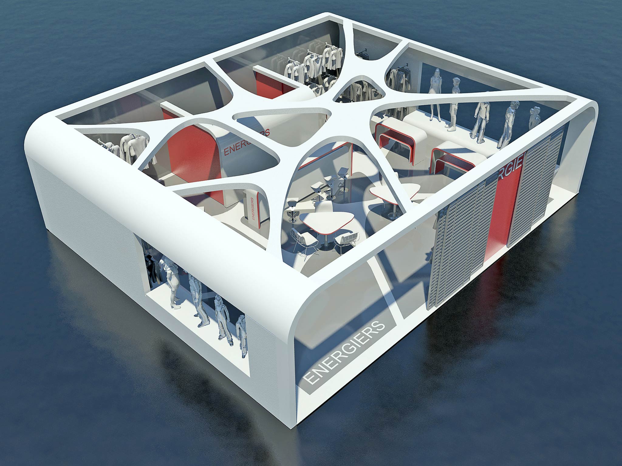
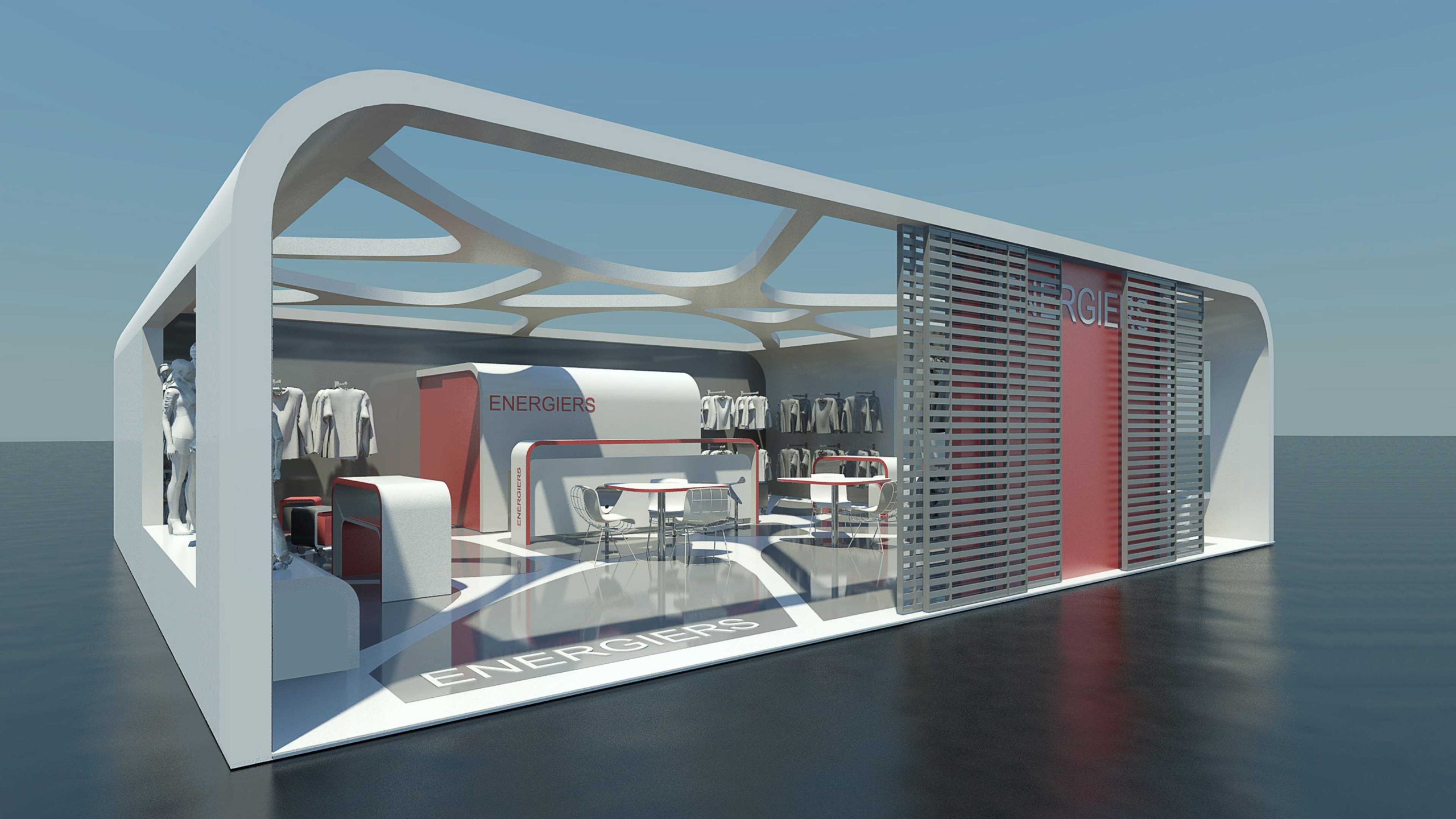
The current study has to do with the design of an exhibition stand for the “ENERGIERS” company.
Generally speaking, exhibition stands are rather complex, usually indoor, constructions. This complexity has to do with the dual purpose of an exhibition stand, which is (through the impression of being a shop) not only to project the firm’s identity among other stands, but also to advertise its products.
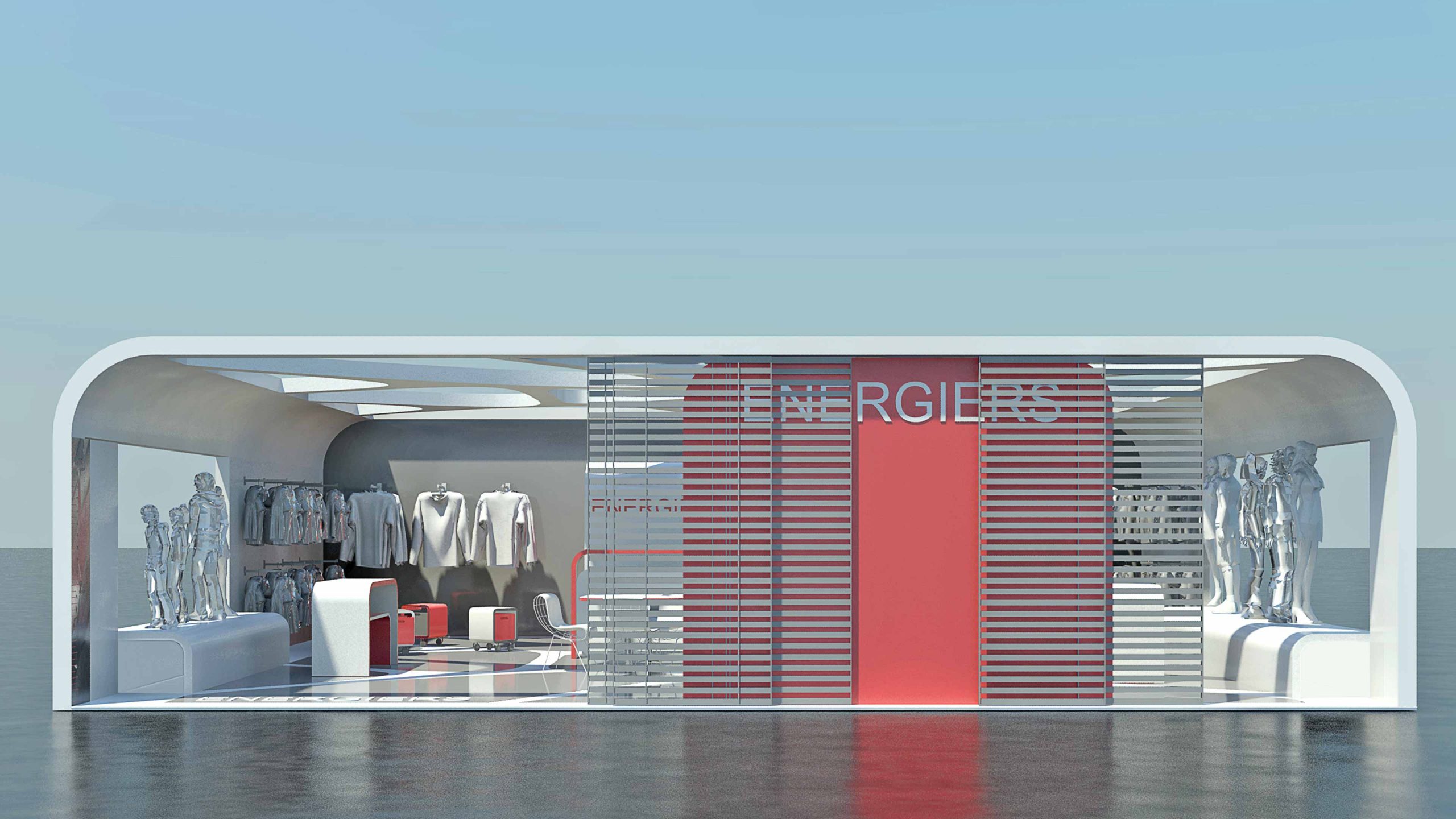
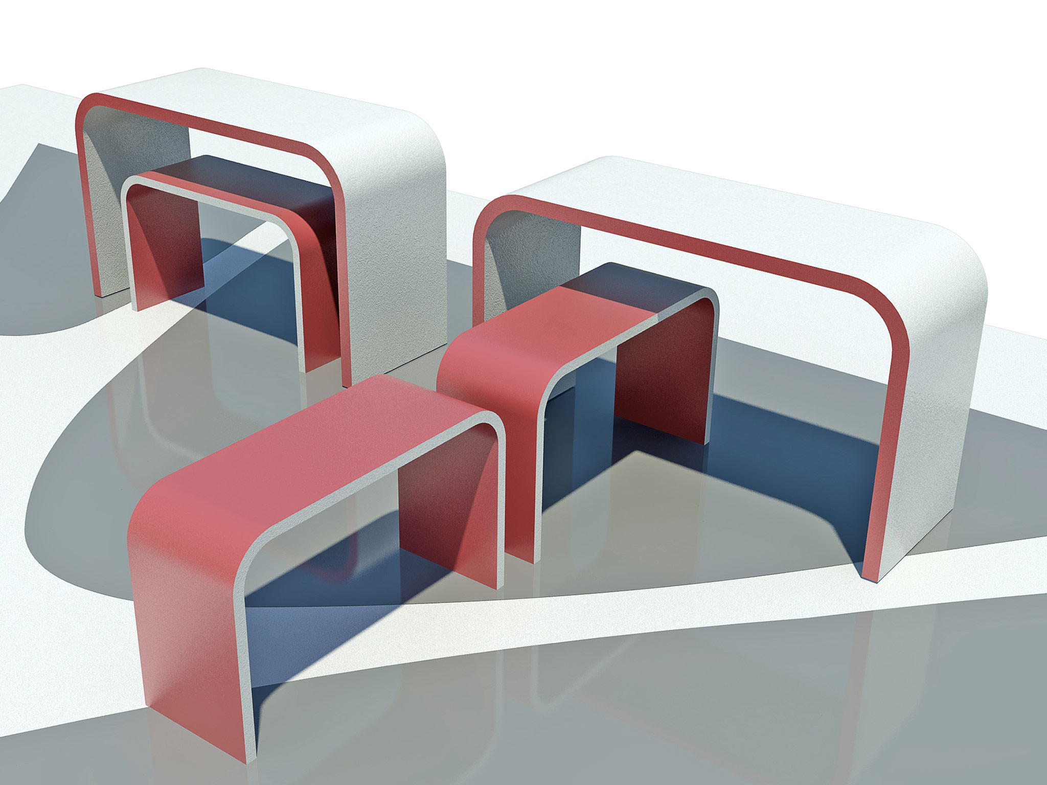
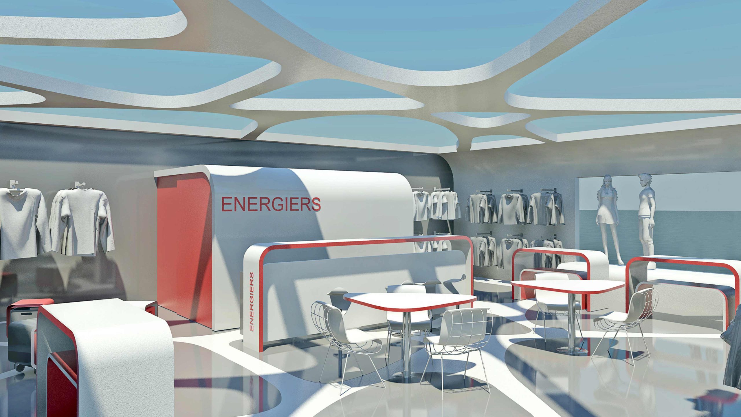
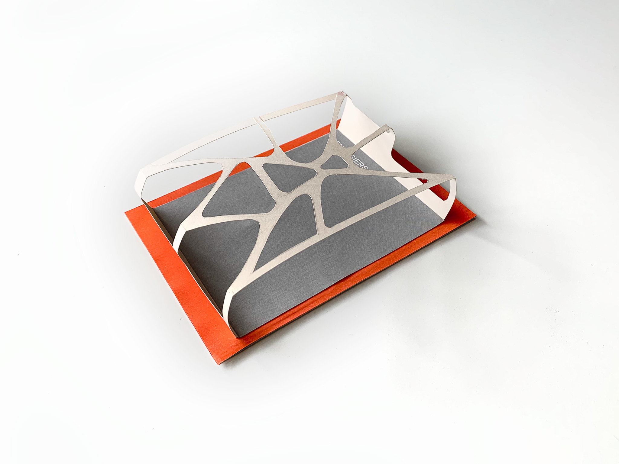
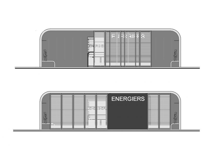
For these reasons we focused on prevailing the same design principles as the ones used at the shop of the same company. These design principles are the “dynamic” facade in accordance to the “smooth” internal space. In order to maintain that dominant nature there is a need of expanding the shop windows to both sides of the structure by constructing new projection benches.
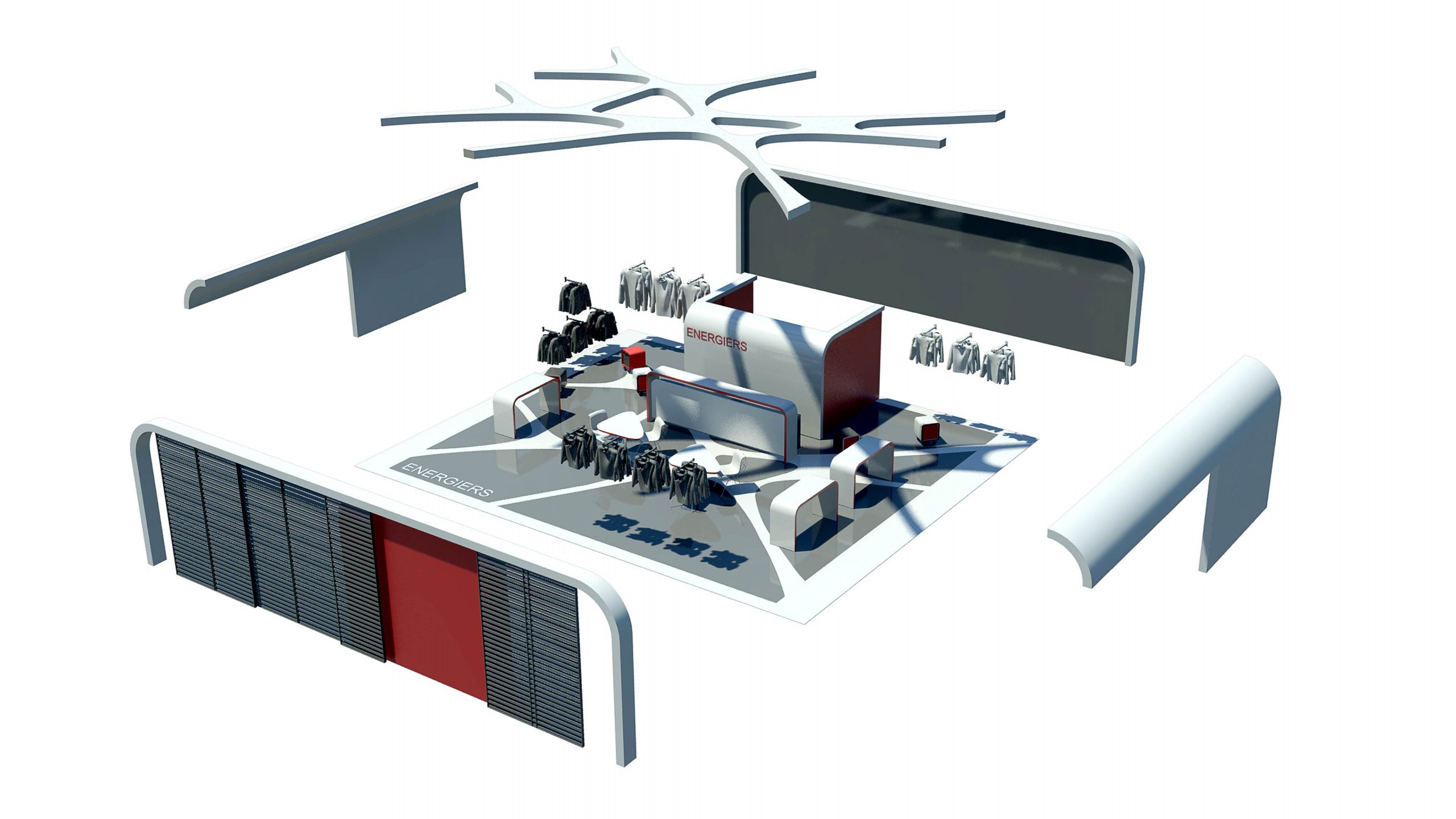
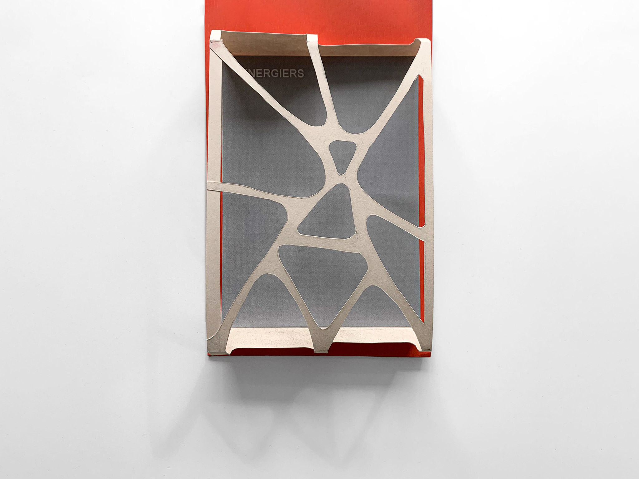
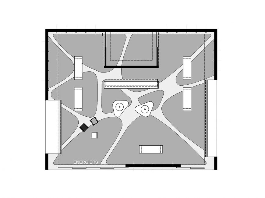
The stand’s use of space is distributed along two zones. The first one includes the shop windows and the second the exhibition of the products. The basic morphological characteristics are the sliding panels of the exhibition stand’s facade, the gaps at the ceiling which have the shape of the recesses used in the shops, the shop’s windows benches at both sides of the structure.
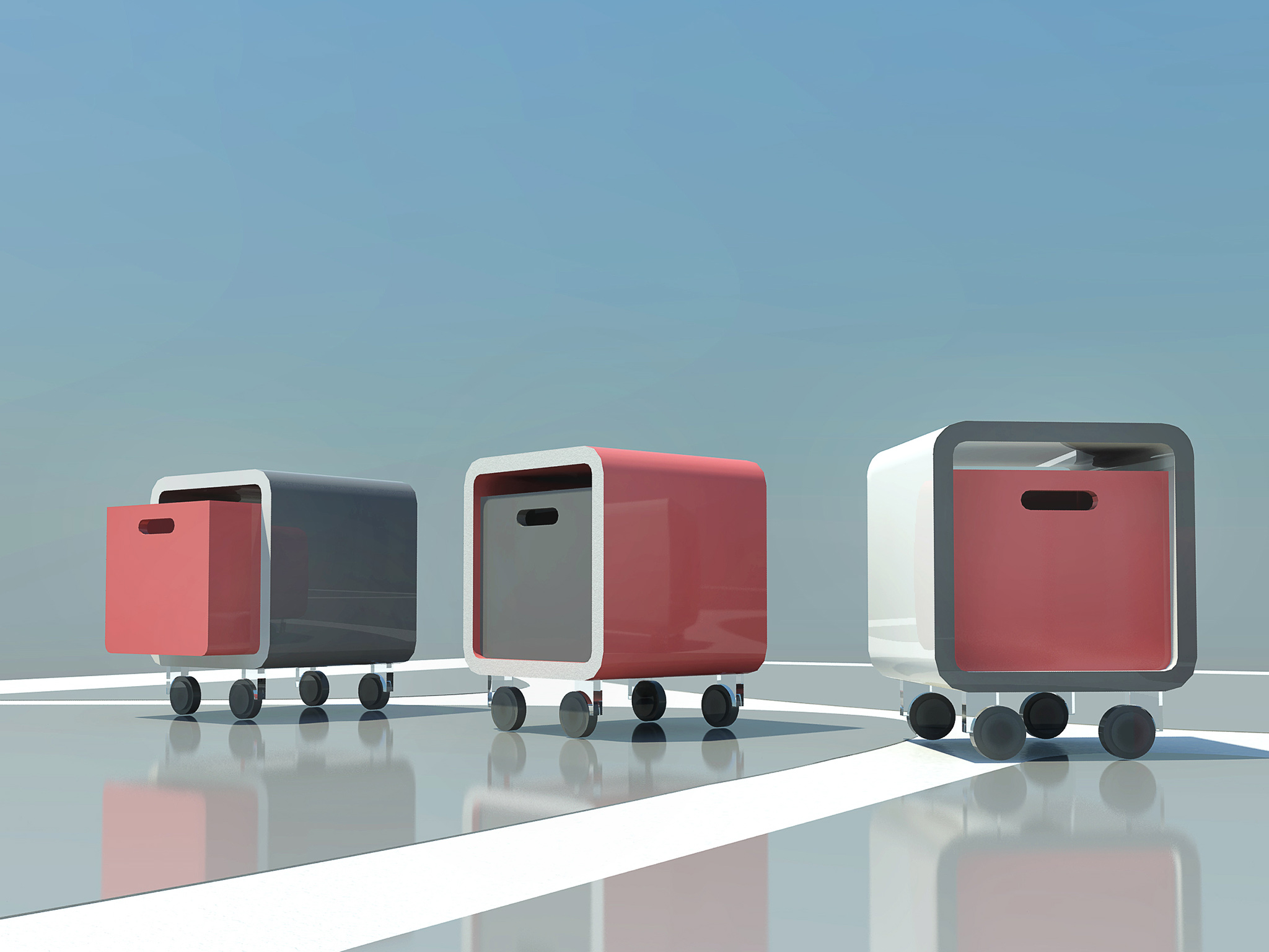
As mentioned before the spatial organization of the exhibition stand shows a division between two functional parts; one projecting the stand to the visitors and a second one for the exhibition of the products. This partition also accommodates a small storage unit following the same design principles. A customer service desk and a number of seats have been allocated in front of this unit. The central area of the stand includes a sitting- socialization area surrounded by free movement exhibition space.
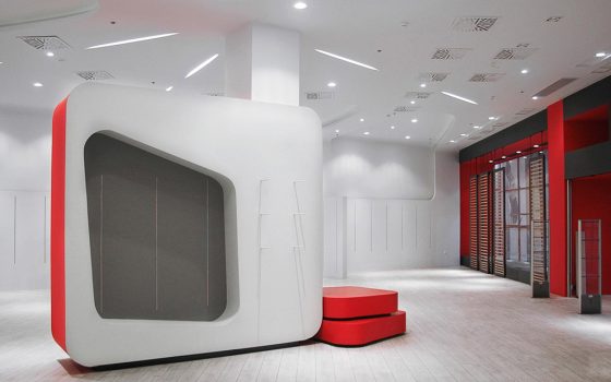
The exhibition stand’s furniture conceptualization follows the same design principles as the ones used in the store’s furniture in order to provide simple and fast manufacturing.
These are the curvy forms, the differentiation of the colors on the surfaces (which leads to a more prominent outline of the furniture) and the use of the firms basic colors (light gray, dark gray, red).
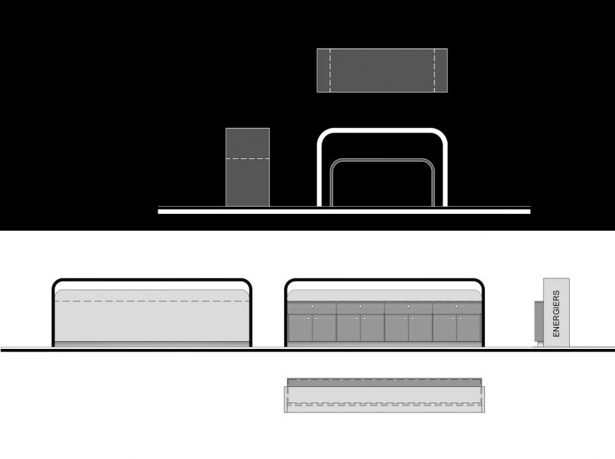
U shaped counters in two different sizes are recommended in order to minimize the space use and to create more projection surfaces for the products.
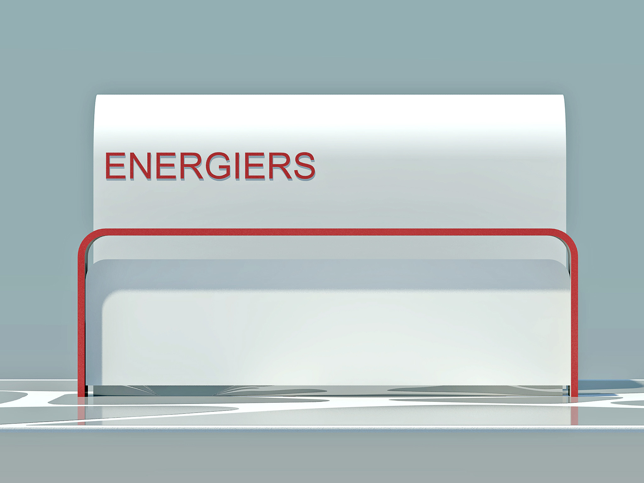
The design of the customers service desk, which is placed in front of the storage unit reminds, morphologically, the cashier furniture used in stores.
Structurally it has two basic elements. The first one which is at the front, visible to the visitor, a rectangle shaped with rounded corners surface and the second one is a service bench at the other side, not visible, with storage spaces.
Facts & Figures
Location
Thessaloniki
Client
Energiers SA
Scale
< 5.000 m²
Study
Architectural Study
Categories
Retail • Leisure,Interior
Key people behind this project
Korina Voulgaridou
Architect
