Project Details
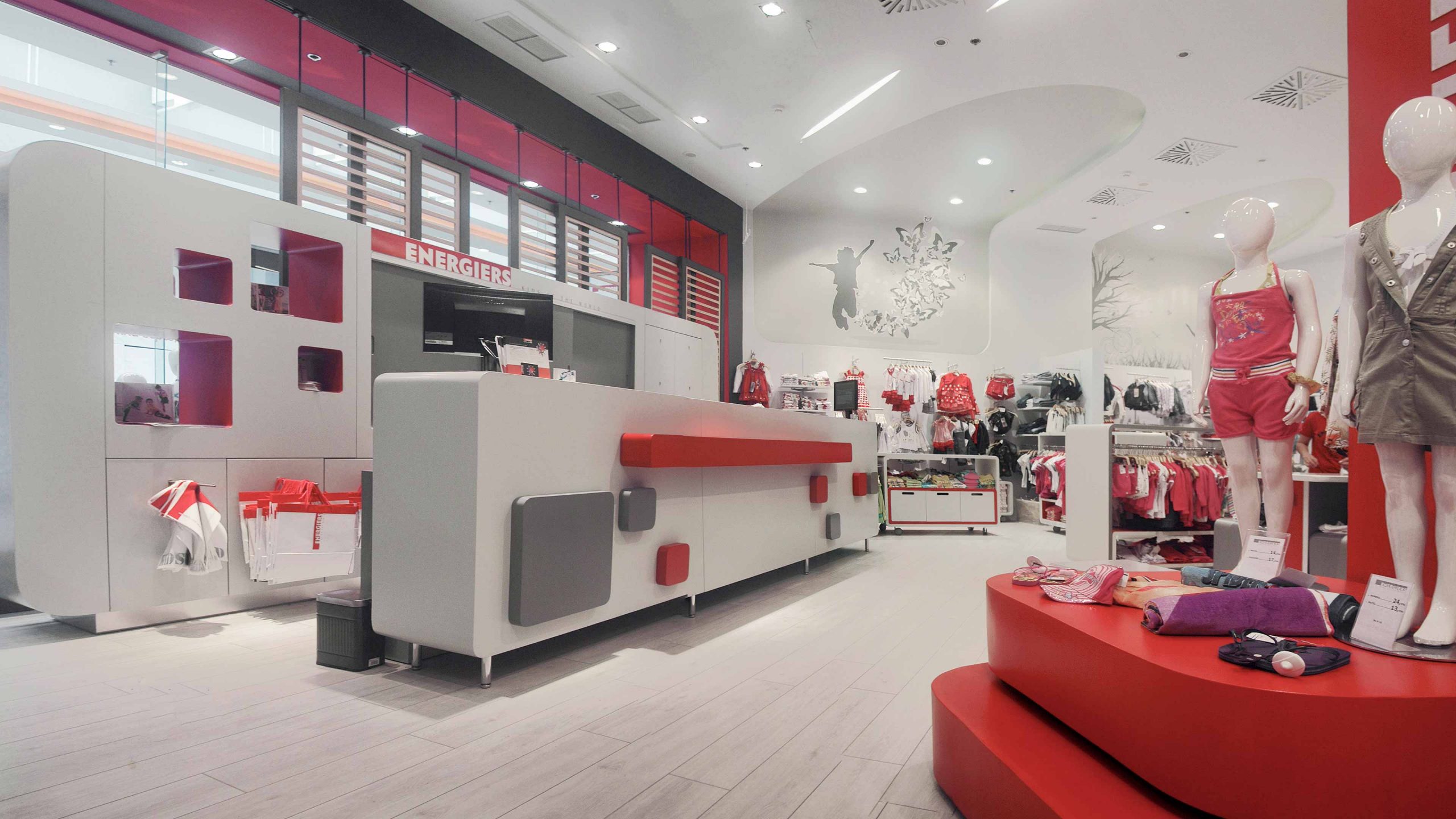
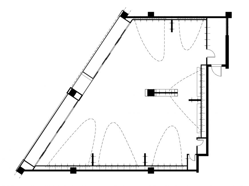
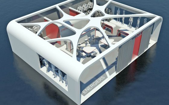
The project is about a kids’ wear shop of 220 s.q., which is locaded at the shopping center “Mediterranean Cosmos” in Thessaloniki.
The design of children’s stores is unique due to the fact that they aim at the same time at children, teenagers and adults. They must, therefore, create a friendly and appealing environment for all ages.
The “key” to success of such a design lies in the harmonious coexistence of dynamic and symbolic elements that are addressed to adolescents, with mild and reassuring forms that create a safe environment for little children, inside a simple and functional entity that facilitates and attracts adults.
Having as a basic principle the above, we chose a combination of dynamic design with lighter forms.
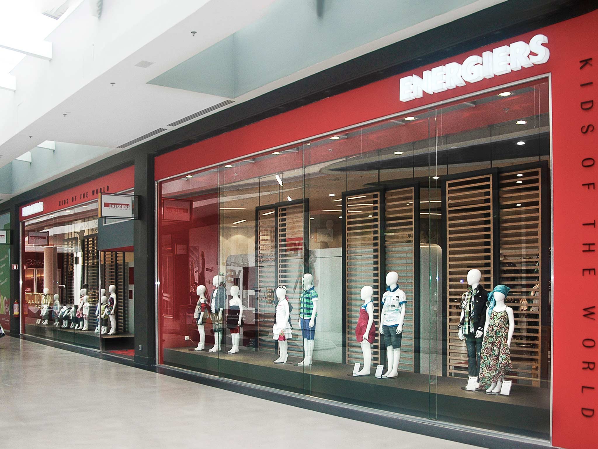
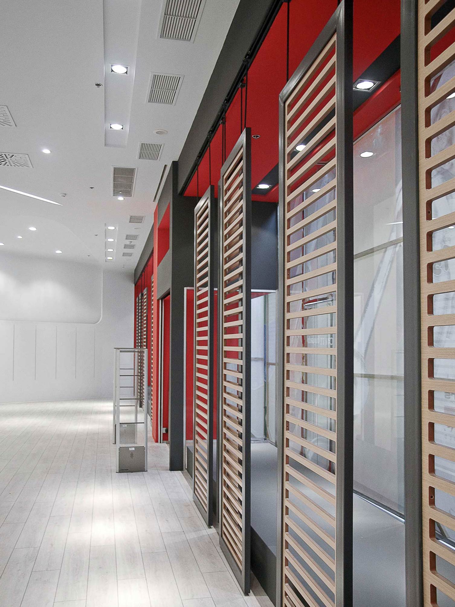
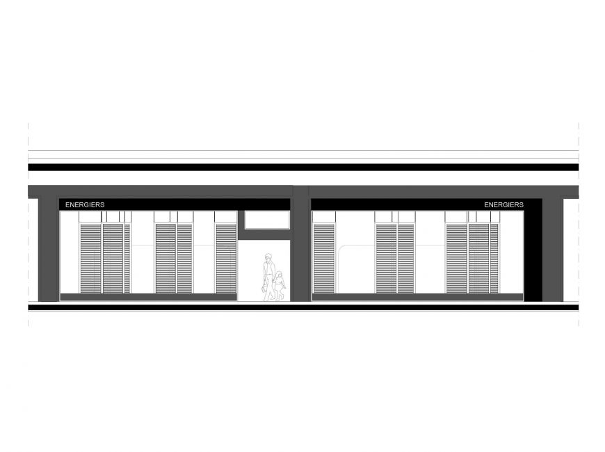
As a dynamic element we have defined the shop’s window, the “first image”. Big, red volumes together with smaller, dark grey (horizontal) ones, frame the glass surfaces of the window attracting, in this manner, the visitor’s attention with their colour and form. The fundamental parameter was the distinguishable placing of the store’s logo on both sides of access of the store.
The movable partitions on the back side of the window essentially function as a border separating the “outside” from the “inside”, as a type of visual transition to the main store space through their semitransparency. Moreover, they operate as a reference to the houses’ “shutters”, activating the desire and possibly the curiosity of the passersby to enter the area.
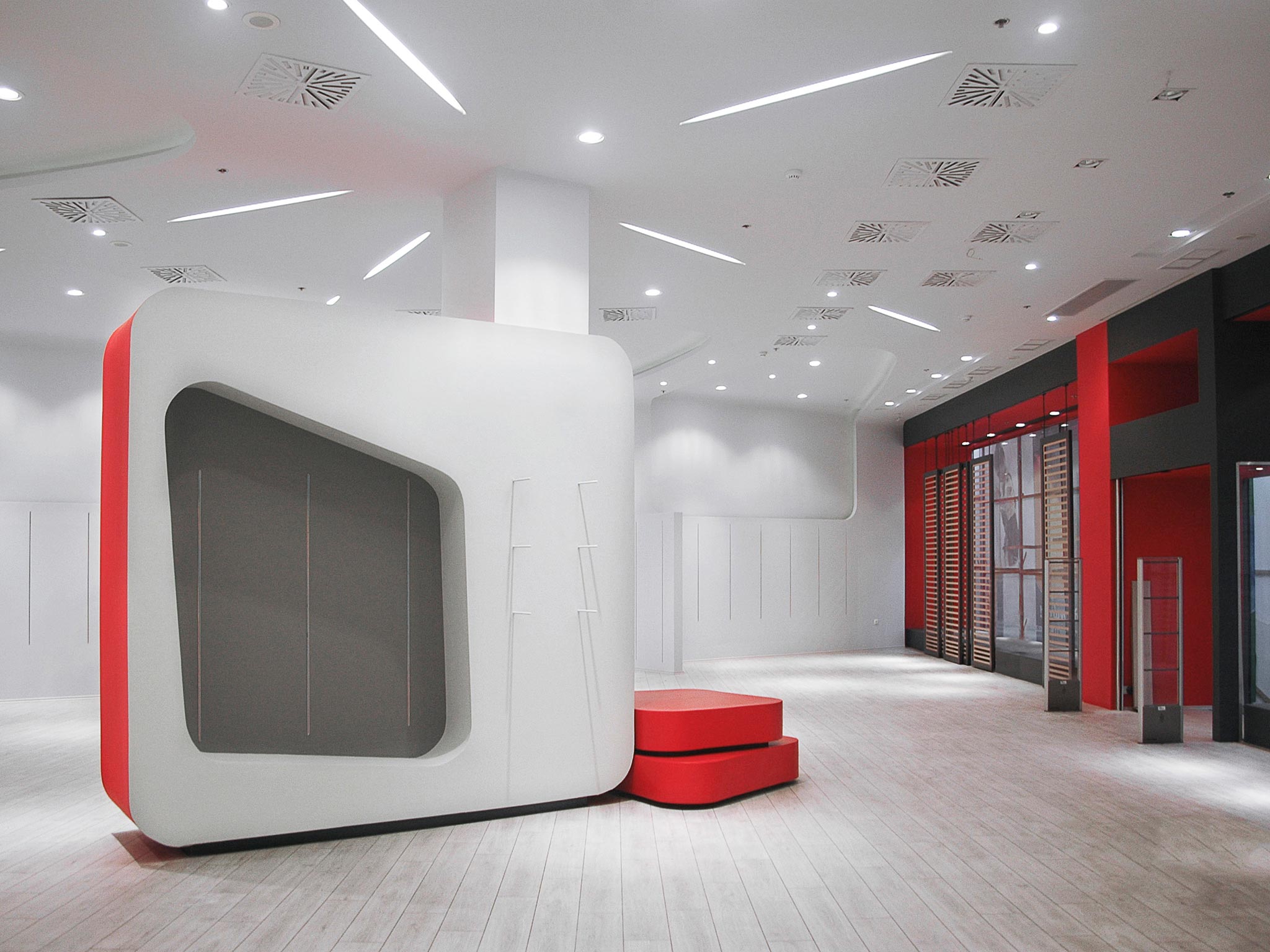
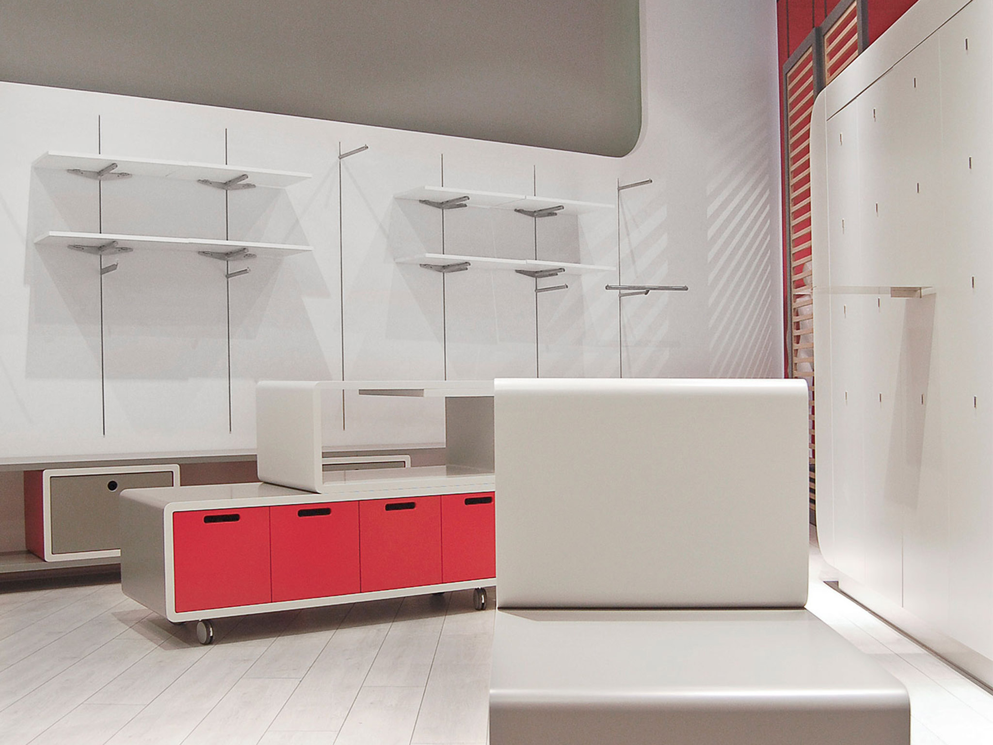
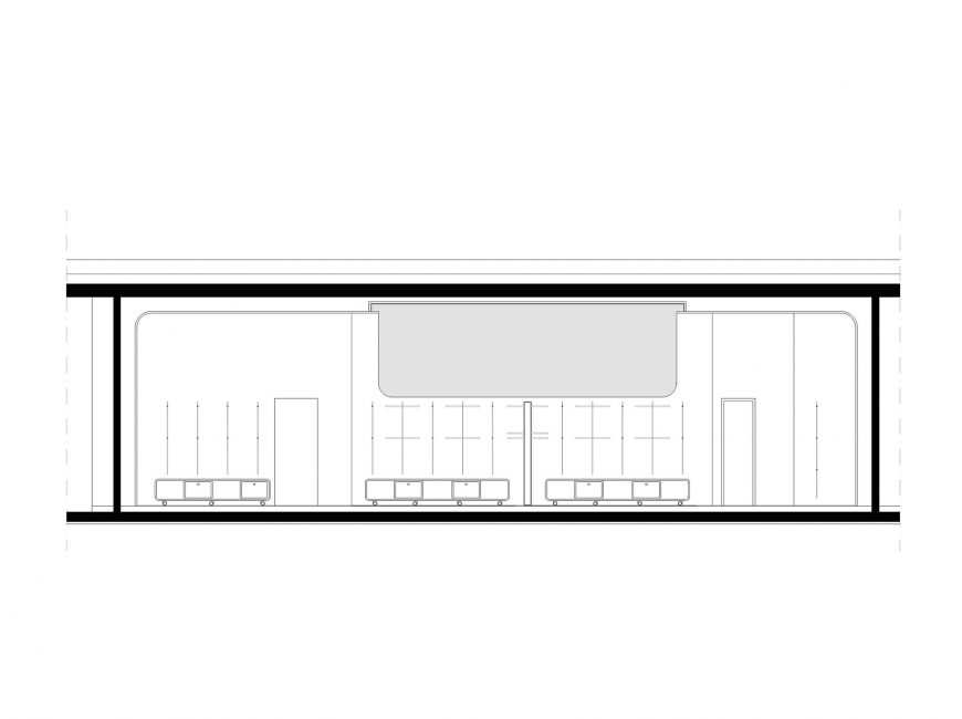
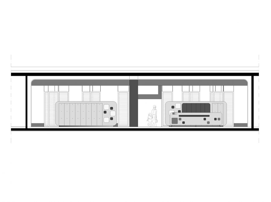
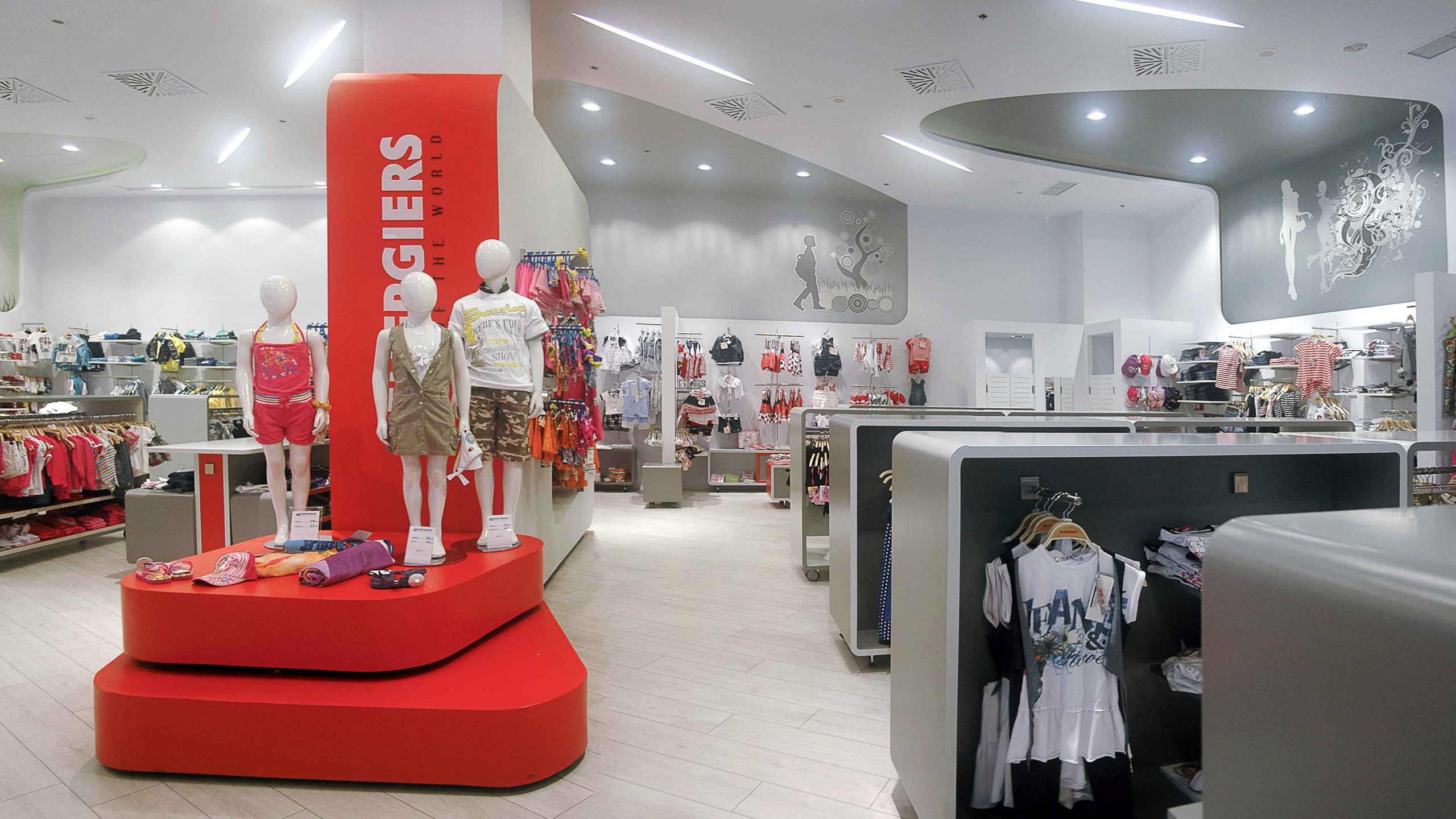
Through its organic morphology, the main internal store area is defined as a mild form. A second, internal shell, with curved edges, is proposed. It is a kind of “cocoon” that associatively refers to the warm pregnancy environment and causes a pleasant sense to the visitor and mainly to children.
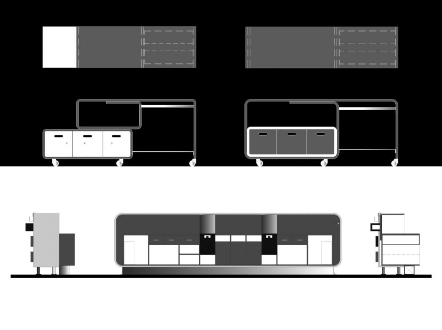
This shell encompasses some organically outlined niches with children’s and adolescents’ images that both “enliven” the space and visually separate its individual sections.
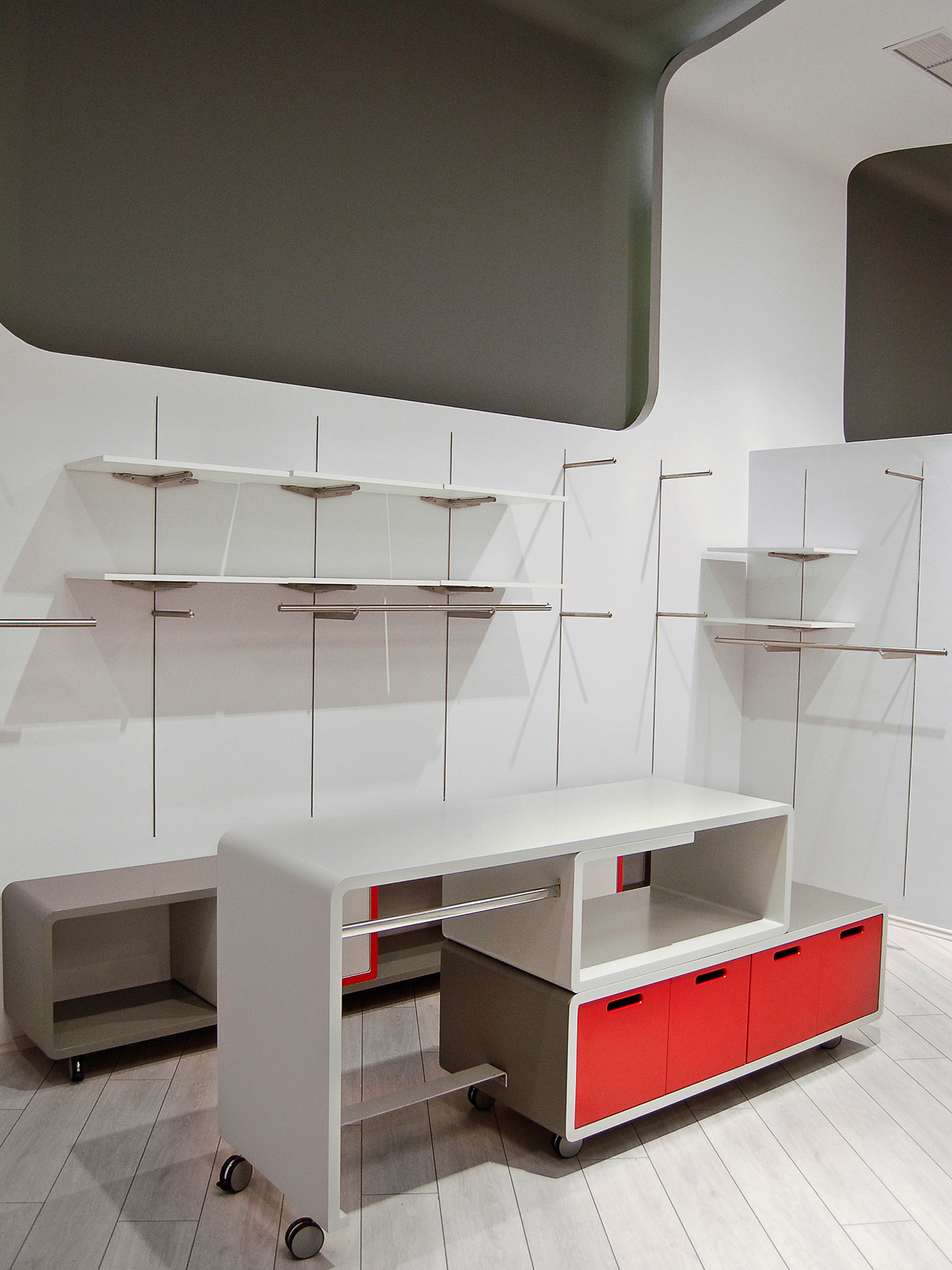
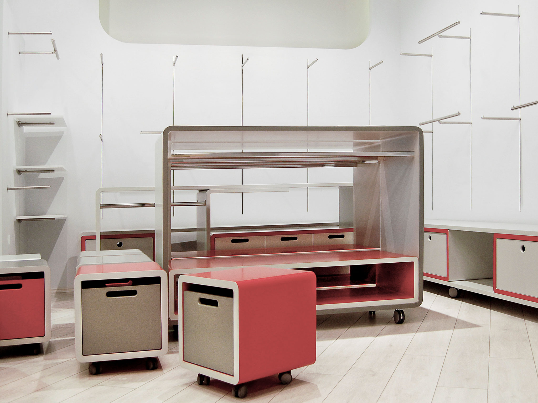
The simplicity and functionality of the entity is ensured by two distinctive height zones: The first one, from the floor to the 2.25 m., a neutral zone in which the exhibit predominates, and the second one, from 2.25 m and higher, that is dedicated to the creation of an atmosphere through the projection of alternate images that depend on the type of exhibit – merchandise in the niches.
In its entire perimeter and up to the niches’ height limit, the shell is distributed in a system of metal guides, which have hanging or display mechanisms placed by the user, depending on the needs of each separate store. The shell is made of single sided plaster-board. For the floor laminate-type, pale light coloured wood, that does not attract the visitor’s attention but warms the space, is proposed.
Facts & Figures
Location
Thessaloniki
Client
Energiers SA
Scale
< 5.000 m²
Study
Architectural Study
Categories
Retail • Leisure,Interior
Key people behind this project
Alexia Prassa
Architect
Korina Voulgaridou
Architect
